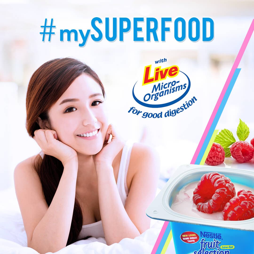
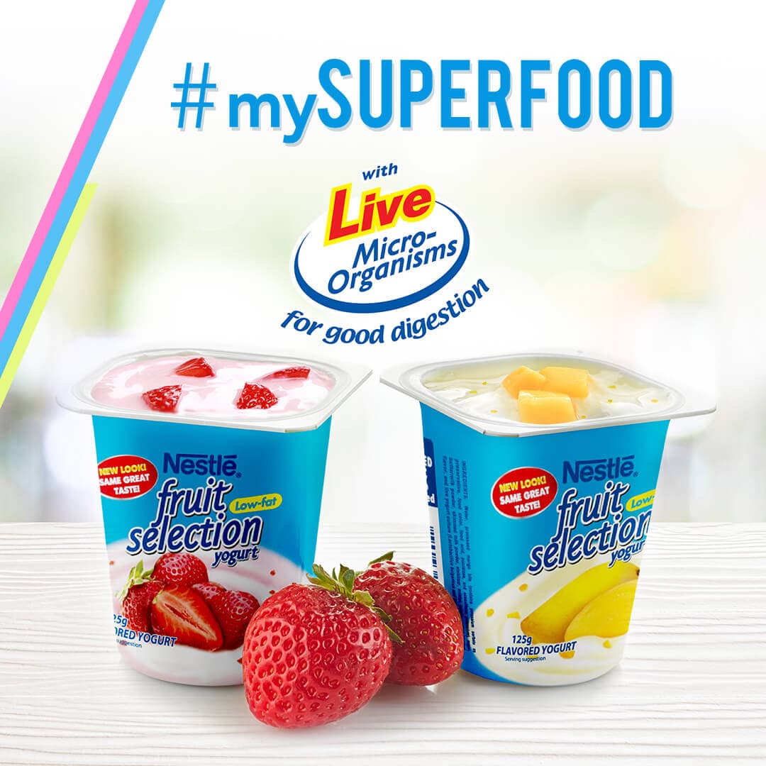
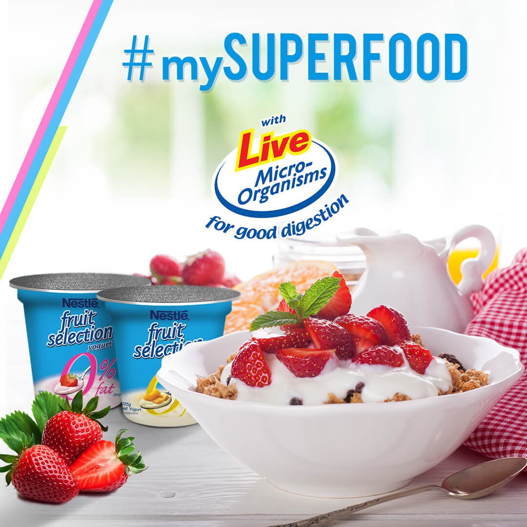
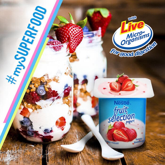
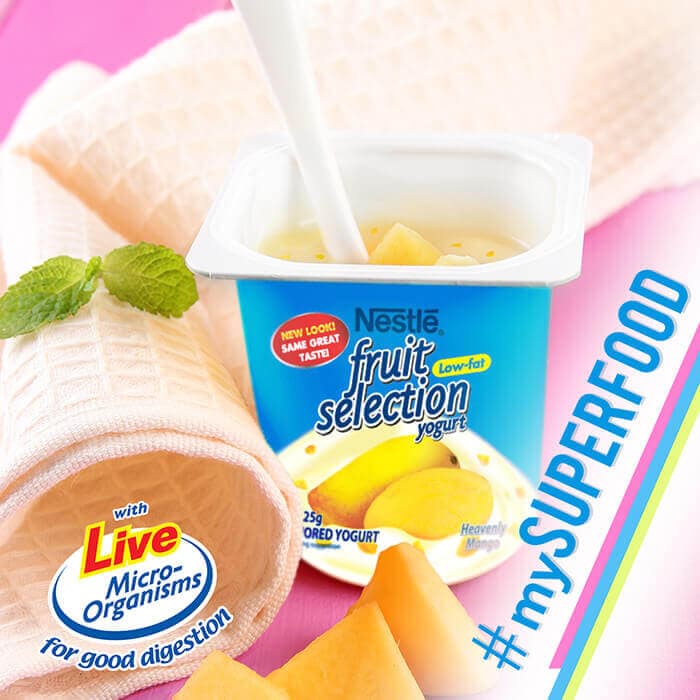
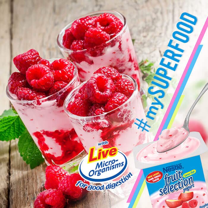
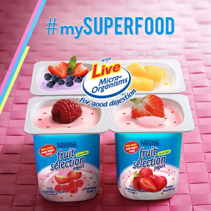
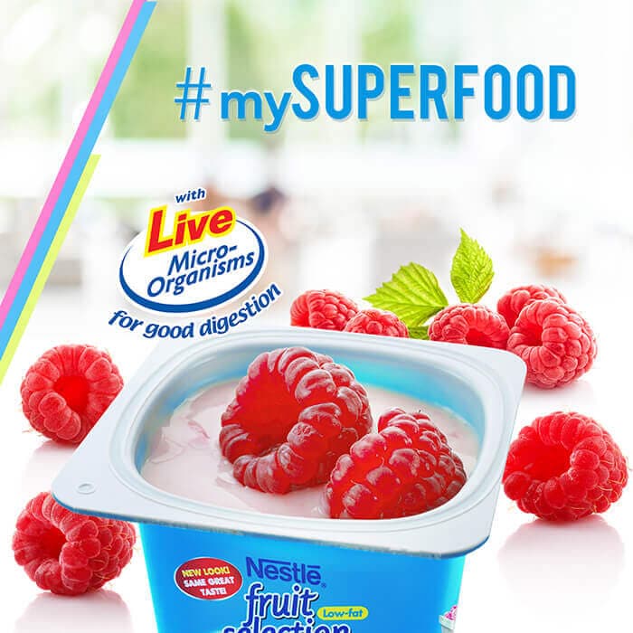
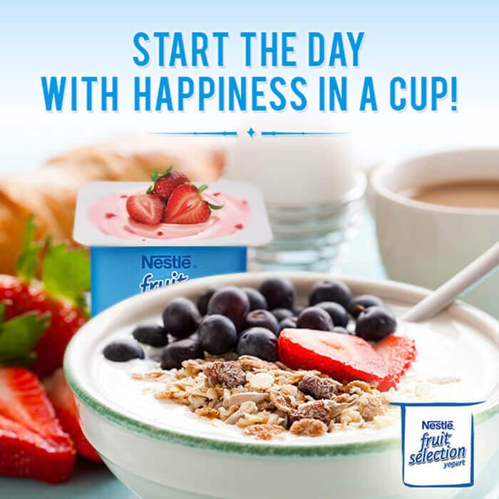
A selection of work made for Nestle #MYSUPERFOOD. Scroll to see the full set.
The challenge
The #MYSUPERFOOD campaign needed a web front-end and a series of social posts that worked as one coherent system. The design had to feel fresh and appetizing, communicate nutrition in an approachable way, and stay aligned with Nestlé's brand standards across both the campaign site and the social feed. Keeping a consistent identity across two different formats was central to the brief.
Our approach
We developed a single campaign visual language and applied it to both the web build and the social series so the two read as parts of the same effort. The front-end was structured to be clean and easy to move through, with food imagery leading and information kept light and scannable. The social posts reused the campaign's type, color, and layout cues so each one was recognizable in a busy feed while still contributing to the broader story. The tone throughout stayed bright, fresh, and accessible.
The outcome
The campaign launched with a consistent identity spanning its website and social posts. The shared visual system made the front-end and the feed feel like one connected effort, giving #MYSUPERFOOD a recognizable, appetizing presence wherever audiences encountered it.